
Mastering Color Theory: A Guide for Graphic Designers
Welcome, fellow design enthusiasts! Today, we’re embarking on a vibrant journey into the kaleidoscopic world of color theory, a realm where hues and shades hold the power to transform designs into visual masterpieces. As graphic design students, understanding the essence of color is like unraveling the magic behind a painter’s palette – it’s the brushstroke that brings life and emotion to our creative canvases.
Picture this: colors aren’t just visual elements; they’re storytellers. In the captivating landscape of graphic design, our color choices narrate tales that resonate with viewers on a subconscious level. This is where color psychology steps into the limelight, revealing the emotional impact that each hue can have on the human mind. From the calming blues to the energetic reds, we’re not just picking colors; we’re orchestrating a symphony of emotions. Think of it as our secret sauce to evoke specific moods and responses in our audience, shaping brand perception and personality.
Speaking of brand personality, let’s dive into the fascinating intersection of color theory and brand identity. As a graphic designer, I’ve witnessed firsthand how color plays a pivotal role in crafting a brand’s distinctive personality. The colors we choose aren’t merely aesthetics; they become the voice of the brand, communicating its values, ethos, and character. Understanding this dynamic relationship allows us to mold brand perception intentionally, ensuring that our designs resonate authentically with the intended audience. So, buckle up, fellow design enthusiasts! We’re about to decode the language of colors and unleash the potential to breathe life into our designs, leaving an indelible mark on the canvas of graphic design brilliance.
Basic Principles of Color Theory
Now that we’ve dipped our toes into the vibrant pool of color theory, let’s take a deeper dive into its basic principles. Picture the color wheel as our trusty compass in this creative voyage. As graphic design students, understanding the fundamentals of the color wheel is like having a treasure map, guiding us through the intricate world of color relationships. Every hue, shade, and tint on the wheel holds a unique role, offering us endless possibilities to craft designs that not only catch the eye but also evoke specific emotions.
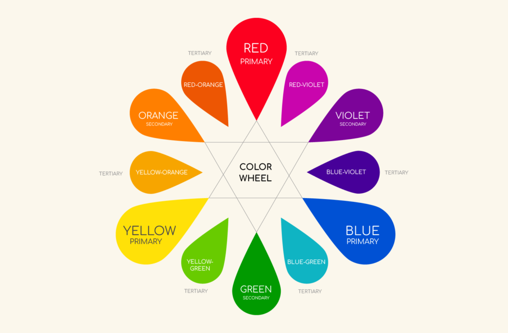
Color Wheel Fundamentals
In the realm of color psychology, the color wheel becomes our palette of emotions. Complementary colors, positioned opposite each other on the wheel, create a dynamic and energetic contrast. This interplay stimulates emotions and draws attention, making it a powerful tool in our creative arsenal. On the flip side, analogous colors, residing adjacent to each other, evoke a sense of harmony and unity. As emerging designers, mastering these color wheel dynamics allows us to strategically tap into the emotional responses of our audience, creating designs that resonate on a profound level.
Color Harmony
Now, let’s segue into the enchanting world of color harmony. Imagine color harmony as the melody that ensues when the right notes are struck on a piano. By understanding and applying different color harmonies – be it complementary, analogous, or triadic – we, as graphic designers, become conductors orchestrating a visual symphony. Complementary harmonies create a sense of balance, analogous harmonies offer cohesion, and triadic harmonies provide vibrancy. These harmonies are more than design techniques; they are the keys to manipulating perception and infusing our designs with a deliberate emotional impact.
As we navigate through the intricacies of the color wheel and harmonies, let’s embrace the notion that our color choices aren’t just about aesthetics – they’re about wielding the brush of emotion and perception. By mastering these basic principles of color theory, we unlock the potential to craft designs that not only speak visually but also resonate emotionally, leaving a lasting imprint on the canvas of graphic design brilliance. So, fellow design enthusiasts, let’s paint our creative narratives with the rich palette of color theory, infusing life and emotion into every stroke.
Psychology of Colors in Design
Now, let’s dive into the fascinating realm of the psychology of colors in design. As graphic design students, understanding the emotional impact of colors is like wielding a powerful wand, capable of shaping perceptions and influencing the way audiences experience our creations. Each color on the spectrum is a conduit for emotions, a visual language that communicates with viewers on a subconscious level.
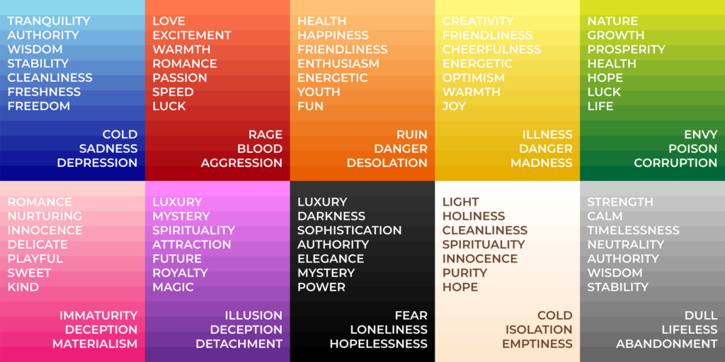
Consider the color red, a hue that packs a punch of intensity and energy. This fiery shade isn’t just eye-catching; it’s a symbol of passion, urgency, and excitement. As designers, strategically incorporating red into our compositions can evoke a sense of dynamism and captivate attention. On the flip side, the tranquil blues and greens resonate with calmness and serenity. These hues are like a breath of fresh air, creating spaces of relaxation and tranquility within our designs.
Now, let’s talk about the subtle dance of warm and cool tones. Warm colors, like reds, oranges, and yellows, radiate a sense of warmth, energy, and positivity. They’re the visual equivalent of a friendly greeting, inviting viewers to engage with our designs on a personal level. In contrast, cool colors, such as blues and greens, convey a feeling of calmness and professionalism. Employing these tones strategically can evoke a sense of trust and reliability, crucial elements in shaping brand perception.
As we traverse the landscape of color psychology, let’s not forget the neutral tones – the unsung heroes of design. Blacks, whites, and grays may seem understated, but they wield immense power in conveying sophistication, modernity, and timelessness. Mastering the art of combining these neutrals with pops of vibrant colors allows us, as graphic designers, to strike a harmonious balance, creating designs that are not only visually appealing but also emotionally resonant.
Mastering Color in Branding and Marketing
Now, let’s delve into the captivating intersection of color and branding, where our understanding of hues transforms into a powerful tool for shaping brand identities and influencing consumer behavior. As graphic design students and creative enthusiasts, mastering color in branding and marketing is akin to holding the key to a brand’s visual signature. Each color choice becomes a deliberate brushstroke, contributing to the narrative that defines a brand’s personality, values, and market positioning.
Consider the golden arches of McDonald’s or the distinct blue hue of Facebook – these color choices are not arbitrary but intentional decisions strategically embedded in the fabric of brand identity. In the realm of branding, colors are more than aesthetics; they become the voice of a brand, resonating with audiences and creating a visual language that is uniquely theirs. As designers, our role extends beyond the visual appeal; we become storytellers, using colors as the chapters that unfold the essence of a brand.
Venturing into the realm of marketing, our color palette becomes a beacon that guides consumer perception. Certain colors trigger specific emotions and associations, influencing purchasing decisions and brand loyalty. Warm and inviting colors may evoke feelings of comfort and approachability, while bold and vibrant hues might convey a sense of innovation and dynamism. By strategically aligning color choices with brand messaging, we, as designers, become architects of consumer experiences, sculpting designs that not only catch the eye but also linger in the memory.
Conclusion
In the ever-evolving landscape of branding and marketing, our understanding of color extends to creating cohesive and impactful color palettes. Consistency across various touchpoints – from logos to marketing collateral – reinforces brand recognition and fosters a sense of trust. As emerging design enthusiasts, let’s recognize the potential of our color choices to leave an indelible mark on the minds of consumers. By mastering color in branding and marketing, we contribute to the creation of visual identities that transcend trends and stand as timeless symbols of brand excellence. So, fellow design enthusiasts, let’s paint the canvas of brand stories with the rich palette of colors, creating visual narratives that not only captivate but also leave a lasting imprint on the hearts of consumers.